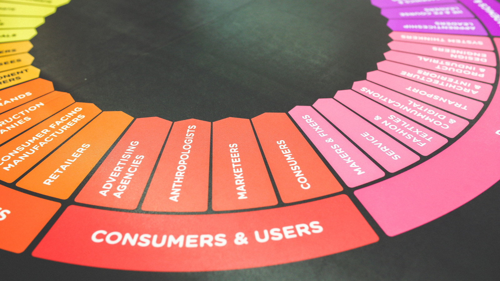
Color Psychology in Branding: What Your Favorite Brands Are Really Saying
How the World’s Biggest Companies Use Color to Build Trust, Influence Emotions, and Shape Consumer Decisions
Have you ever wondered why banks often choose blue, luxury brands embrace black, or fast-food chains rely on red and yellow?
It isn’t a coincidence.
Before customers read a slogan, visit a website, or try a product, they react to color. Within seconds, the human brain begins forming opinions about trust, quality, personality, and even value based solely on visual cues.
Color has become one of the most powerful communication tools in branding. It influences first impressions, strengthens brand recognition, and helps businesses create emotional connections with consumers.
Think about Coca-Cola without red, Tiffany & Co. without its iconic blue, or Starbucks without green. It feels almost impossible because those colors have become part of each brand’s identity.
Of course, color alone doesn’t build a successful brand. A great logo won’t compensate for poor products or weak positioning. But when color aligns with strategy, personality, and customer experience, it becomes one of the strongest assets a business can own.
Before exploring each color in detail, here’s a quick overview of what different colors typically communicate in branding.
Color Psychology at a Glance
| Color | Common Brand Associations |
| 🔵 Blue | Trust, professionalism, security, reliability |
| 🔴 Red | Passion, excitement, action, energy |
| 🟡 Yellow | Optimism, creativity, happiness |
| 🟢 Green | Nature, health, sustainability, growth |
| 🟣 Purple | Luxury, creativity, imagination |
| 🟠 Orange | Energy, friendliness, accessibility |
| ⚫ Black | Elegance, sophistication, exclusivity |
| ⚪ White | Simplicity, purity, minimalism |
| ⚪ Gray | Balance, neutrality, professionalism |
Why Color Matters in Branding
Color influences much more than aesthetics.
Studies in consumer psychology suggest that people form first impressions within seconds, and color plays a significant role in that process. It helps customers recognize brands faster, influences emotional responses, and can even shape purchasing decisions.
A carefully selected color palette also creates consistency across websites, packaging, social media, advertising, and physical stores, making brands easier to remember.
While there is no universal meaning attached to every color, certain associations have become deeply rooted through culture, marketing, and repeated exposure.
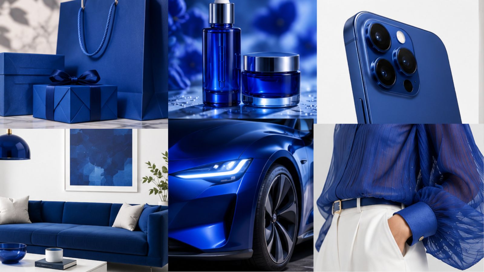
Blue: Trust, Confidence, and Stability
Blue remains the most popular corporate color worldwide.
It communicates security, professionalism, intelligence, and dependability, making it especially common among financial institutions, healthcare companies, and technology brands.
Famous Examples
- IBM
- Visa
- PayPal
- Dell
Best For
- Banks
- Technology companies
- Healthcare
- Professional services
- Consulting firms
Consider Carefully
Blue can sometimes feel distant or overly corporate if not balanced with warmer elements.
Red: Energy That Demands Attention
Red is impossible to ignore.
It symbolizes excitement, passion, urgency, and confidence. It naturally attracts attention and encourages quick action, which explains why it’s widely used in food, entertainment, and retail.
Famous Examples
- Coca-Cola
- Netflix
- YouTube
- Ferrari
- Canon
Best For
- Restaurants
- Sports
- Entertainment
- Sales campaigns
- Food brands
Consider Carefully
Too much red may create visual fatigue or communicate aggression if not used strategically.
Yellow: Optimism and Positivity
Yellow is often associated with sunshine, happiness, creativity, and friendliness.
It quickly captures attention, making it ideal for brands that want to appear energetic and approachable.
Famous Examples
- McDonald’s
- IKEA
- Best Buy
- National Geographic
Best For
- Family brands
- Education
- Children’s products
- Retail
Consider Carefully
Bright yellow should be used in moderation because excessive use may reduce readability.
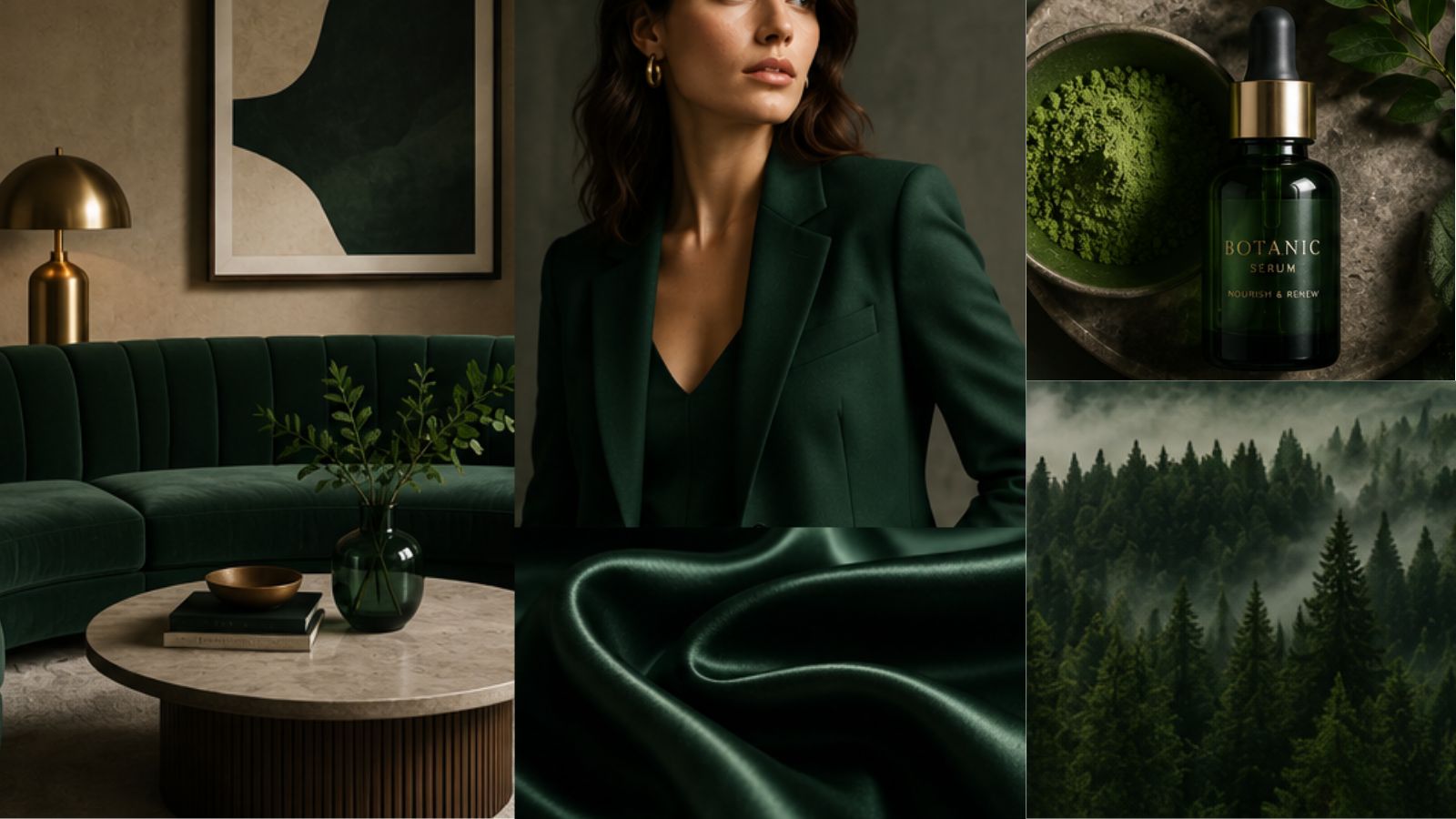
Green: Health, Nature, and Growth
Green has become the color of sustainability.
Consumers naturally associate it with wellness, balance, fresh food, environmental responsibility, and financial growth.
Famous Examples
- Starbucks
- Whole Foods
- Spotify
- Animal Planet
Best For
- Organic products
- Wellness
- Sustainability
- Financial services
- Outdoor brands
Consider Carefully
Different shades communicate different messages. Dark green often feels luxurious, while bright green appears more energetic.
Purple: Creativity Meets Luxury
Purple has long been connected with royalty, prestige, and imagination.
Today, brands use it to communicate originality, innovation, and premium positioning.
Famous Examples
- Cadbury
- Hallmark
- Yahoo
- Twitch
Best For
- Beauty
- Luxury products
- Creative businesses
- Premium services
Orange: Friendly, Modern, and Energetic
Orange combines the warmth of red with the optimism of yellow.
It feels welcoming, youthful, and accessible.
Famous Examples
- Fanta
- Home Depot
- Nickelodeon
- Harley-Davidson
Best For
- Startups
- Fitness
- Retail
- Education
- Technology
Black & White: The Language of Luxury
Few color combinations communicate elegance as effectively as black and white.
Black suggests sophistication, authority, exclusivity, and timeless style.
White represents simplicity, cleanliness, minimalism, and clarity.
Together, they create one of the strongest visual identities in branding.
Famous Examples
- Chanel
- Apple
- Nike
- Prada
- Saint Laurent
- Dior
Best For
- Fashion
- Luxury
- Architecture
- Premium technology
Gray: Modern, Neutral, and Professional
Gray is often underestimated.
It communicates balance, maturity, sophistication, and stability without overpowering other visual elements.
Famous Examples
- Mercedes-Benz
- Audi
- Lexus
- Wikipedia
Best For
- Automotive
- Engineering
- Corporate businesses
- Technology
The Biggest Mistake Businesses Make
One of the most common branding mistakes is choosing colors based on personal preference rather than strategy.
Many entrepreneurs simply ask:
“What is my favorite color?”
The better question is:
“What should my audience feel when they see my brand?”
Successful color selection begins with positioning, not aesthetics.
The right palette depends on:
- Your target audience
- Your industry
- Your brand personality
- Your market positioning
- The emotions you want to evoke
How the World’s Biggest Brands Combine Colors
Most successful brands don’t rely on just one color.
They carefully combine colors to reinforce their positioning.
| Brand | Color Strategy |
| Apple | Black, white, gray for minimalism and innovation |
| McDonald’s | Red for excitement and yellow for happiness |
| Starbucks | Green and white for freshness and sustainability |
| Netflix | Black and red for entertainment and intensity |
| Multiple colors to express creativity, accessibility, and innovation | |
| Tiffany & Co. | Signature robin’s egg blue for exclusivity and elegance |
These color systems become instantly recognizable, even without a logo.
Color Is Only One Piece of Branding
Color is powerful.
But color alone doesn’t build a memorable brand.
Successful branding combines:
- Positioning
- Brand strategy
- Typography
- Visual identity
- Photography
- Tone of voice
- Customer experience
- Consistency
A beautiful logo without a clear strategy is simply decoration.
The strongest brands communicate the same message across every customer interaction.
Final Thoughts
Color influences how we think, feel, and remember brands long before we read a single word.
That’s why the world’s most recognizable companies invest so much time defining their visual identity. Every color choice supports a larger strategy designed to build trust, communicate personality, and create lasting emotional connections.
If you’re building a new brand or refreshing an existing one, don’t choose colors simply because you like them.
Choose the colors that best represent your values, speak to your audience, and reinforce the experience you want people to have.
Because in branding, color isn’t just decoration.
It’s communication.


Post Comment