WGSN’s 2027 Color of the Year: Why Luminous Blue Is More Than Just a Trend
The color that reflects the future of technology, emotion, and human connection.
Every year, designers, marketers and global brands eagerly anticipate WGSN’s Color of the Year announcement. More than a simple color forecast, these selections are built on years of consumer research, cultural analysis and market intelligence, often influencing fashion, interiors, technology, beauty and branding long before products reach consumers.
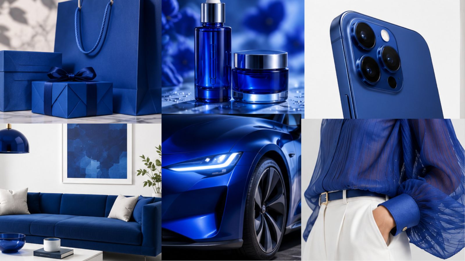
For 2027, WGSN and Coloro selected Luminous Blue as the Color of the Year. Bold, electric and emotionally charged, this vibrant shade represents much more than aesthetics. It captures how consumers are redefining their relationship with technology, creativity and human connection in an increasingly complex world.
More Than a Beautiful Blue
At first glance, Luminous Blue feels energetic and futuristic. However, its meaning goes far beyond its appearance.
According to WGSN, the defining concept for 2027 is interconnectedness. Rather than seeing the world through opposites, consumers are learning to balance different realities:
- Nature and technology
- Physical and digital experiences
- Tradition and innovation
- Logic and emotion
- Individual identity and community
Luminous Blue symbolizes this intersection. It looks toward the future without abandoning the wisdom of the past, creating a color that feels both innovative and timeless.
Why Blue?
Blue has always represented trust, intelligence and stability.
What makes Luminous Blue different is its intensity.
Inspired by both lapis lazuli, one of history’s most valuable blue pigments, and cobalt, an essential material in today’s battery technologies, the color bridges craftsmanship with technological progress. It reflects a society increasingly shaped by clean energy, digital innovation and advanced technology while maintaining a desire for authenticity and meaning.
The Emotional Shift Behind the Color
Color forecasting isn’t only about design. It reflects how people feel.
Consumers entering 2027 continue to face economic uncertainty, rapid technological change and information overload. In response, they seek products and brands that provide both confidence and emotional reassurance.
Luminous Blue delivers exactly that balance.
It communicates:
- Confidence without arrogance
- Optimism without naivety
- Innovation without coldness
- Energy without chaos
This emotional complexity explains why WGSN believes the shade will resonate across industries.
The Rise of Emotion-Driven Consumption
Today’s consumers don’t simply buy products.
They buy experiences.
They buy values.
They buy identity.
Brands that succeed in 2027 will be those capable of creating emotional resonance, and color plays a critical role in that perception.
Blue has long been associated with reliability, but Luminous Blue introduces a fresh layer of creativity and boldness that appeals to younger generations while remaining trustworthy for established audiences.
It becomes a visual language for innovation.
Branding Implications
For companies, adopting a trend color doesn’t mean repainting an entire brand.
Instead, trend colors often inspire campaigns, packaging, seasonal collections and digital experiences.
Luminous Blue is especially relevant for:
- Technology companies
- Startups
- Financial services
- Healthcare
- Wellness brands
- Educational platforms
- Luxury products
- Consumer electronics
Because it is gender-inclusive and seasonless, WGSN predicts it will work across multiple categories and international markets.
Fashion’s Next Chapter
Fashion will likely embrace Luminous Blue in both performance wear and premium collections.
Its versatility allows it to move between:
- Activewear
- Occasion wear
- Accessories
- Footwear
- Luxury fashion
Unlike highly seasonal colors, this shade has the flexibility to remain relevant across multiple collections.
Interior Design: Bold Yet Timeless
Interior designers increasingly use color to create emotional environments.
Luminous Blue offers an alternative to sterile neutrals by introducing depth without overwhelming a space.
Expect to see it in:
- Accent walls
- Upholstery
- Kitchens
- Decorative objects
- Lighting
- Hospitality environments
It pairs especially well with warm neutrals, natural wood, brushed metals and textured materials.
Beauty and Packaging
Beauty brands are expected to incorporate Luminous Blue through:
- Makeup collections
- Luxury skincare packaging
- Fragrances
- Premium cosmetic branding
Its luminous character immediately attracts attention on shelves while maintaining a premium appearance.
Technology Will Embrace It
Perhaps no industry aligns more naturally with Luminous Blue than technology.
Its connection to cobalt, electricity and innovation makes it ideal for:
- Consumer electronics
- Smart devices
- AI products
- Electric mobility
- Digital platforms
Glossy, metallic and lacquered finishes enhance its futuristic appeal.
The Complete WGSN Spring/Summer 2027 Palette
While Luminous Blue is the headline color, WGSN also introduced four complementary key colors for Spring/Summer 2027:
- Energy Orange, representing resilience and adaptability.
- Pop Pink, symbolizing joy, playfulness and emotional optimism.
- Meadowland Green, inspired by slower living, nature and community.
- Clay, a warm earthy neutral associated with trust and resilience.
Together, these colors reflect consumers’ search for emotional balance, sustainability and meaningful experiences.
What Businesses Can Learn
The biggest lesson isn’t simply “use more blue.”
The real message is that consumers are looking for brands capable of balancing technology with humanity.
Businesses should ask:
- Does our visual identity reflect innovation?
- Are we creating emotional connections?
- Does our brand feel trustworthy?
- Are we adapting to changing consumer expectations?
Color is one of the fastest ways to communicate these values.
Final Thoughts
Luminous Blue represents far more than a design trend.
It reflects a future where innovation and emotion coexist, where digital experiences become more human and where brands succeed by building genuine connections rather than simply attracting attention.
For designers, marketers and entrepreneurs, understanding why this color matters is more valuable than simply following the trend.
Because the future isn’t just about what consumers see.
It’s about how brands make them feel.



Post Comment